Responsive Web Design: Prevent Potential Sales Loss with a Mobile Friendly Website

webdesign-information

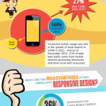
Many business owners today tend to ignore the importance of having a mobile friendly or “responsive” website. Without realizing it, they may be losing prospective leads and sales because their website is not designed to load properly on mobile devices such as laptops, tablets, and smartphones. Here’s why you should not be one of them, and how you can make your website responsive: Watch the video: What is Mobile Responsive Web Design? Your website needs to be mobile friendly, so it needs to be “mobile responsive.” Responsive design is when your website automatically responds or adjusts on the fly to the screen size of the device viewing it. In effect, be it a desktop, a laptop, tablet, or smartphone, your website will load properly. Users Favor Mobile Friendly Sites According to a study commissioned by Google, 74% of users are more likely to return to a mobile-friendly site. But that’s not all. Some 67% of users are more likely to buy if the site is mobile friendly. On the other hand, if your website is not friendly to mobile viewers, you could be in trouble. On the same study, it was found that 48% of users are “frustrated” and “annoyed” by a non-mobile-friendly website. Some 48% said a company “doesn’t care” about its business if its site is not mobile friendly. Some 52% of users are unlikely to engage with a business that has a non-mobile-friendly site. More Mobile Devices Connected Online You need a responsive site as more and more people are using mobile devices to browse online. First of all, ABI Research estimates that there will be 1.4 billion smartphones by the end of 2013. With the current population at 7 billion, that’s 1 smartphone for every 5 people. Meanwhile, comScore estimates that 28% of smartphone owners also […] Read more »

Go for Mobile Responsive Web Design

webdesign-infographics_09

Getting More Leads and Sales, Not Just Fancy Cosmetic Redesign Implementing responsive web design means opening up your online storefront to mobile visitors, effectively increasing your chances of getting more leads and sales through your site. While it may come as a mere fancy redesign to some business owners, you should realize that this change is geared toward marketing more than cosmetics. Making the decision to have a responsive site means giving your business more opportunities to grow, especially for the long haul. See our Infographic: Responsive Defined In a nutshell, a responsive web design adapts itself to multiple screen sizes using the same URL, the same page, the same content, and the same code. Having a responsive web design means your website responds to or adjusts automatically to the size of the screen of various devices: a desktop computer, a laptop, a tablet, or a smartphone. Today is the perfect time to go responsive as mobile ownership is up and will continue to rise in the future. In the U.S. alone, there are already over 120 million smartphones and 50 million tablets, estimates digital research firm comScore. By the end of 2013, there will be 1.4 billion smartphones across the world, adds another research firm, ABI Research. It is also expected that by 2014, there will be more mobile Internet users than desktop users. But it’s not just mobile device ownership you should look at; it’s what people do with their laptops, tablets, and smartphones that you should pay attention to. Digital Media Consumption through Mobile Owners are so engaged with their mobile devices that 37% of time spent on digital media is now driven by smartphones and tablets. Research shows that mobile (43%) is closing in on desktop (57%) in terms of preference when reading news. User preference […] Read more »